Showing posts with label Computer Arts Practice. Show all posts

Monday, 12 May 2014

Company and Title Logos

To finalise the comic covers I have produced a couple of logos. The first is the title of the comic "Hunters".
I chose use the carbon fibre texture from Kara's armour as this is a material I want to feature on the gear of the members of the team of bounty hunters. The font was made square and bold and embossed to give the impression that it was made of a strong substance. The outer glow was added as the logo is fairly dark and this would help it pop against darker covers.


The other logo that was created for the final covers is a mock company logo called "Big Moose Comics". The reason behind the name is a long story but as it features Moose I wanted to make the logo look like a Canadian road sign, the likes seen warning of Moose crossing roads.
Originally I thought about mounting a moose head on a road sign to look like a hunting trophy though by the time the logo was shrunk down any detail would be lost and the "Big" part of the name would be not be illustrated. When shrunk down this logo is bold enough to read and see the image so I feel is more suitable than the original idea.


The 2 logos will be arranged on the covers for final submissions to give more of a complete look.

Kara - Final Cover Art

The final cover art featuring Kara for Computer Arts Practice. This character was designed as part of my Creative Research module. 
For this cover I wanted to do a close up of the character rather than another full figure shot like the previous cover featuring Siyok. I chose this to go forward with as based on feedback from previous modules I lack texture in my painting. Prior to this I haven't experimented with texture overlays and texture brushes in paintings.


Looking back on the painting now I feel that there are a number of issues. Firstly the form and anatomy of the character are off in places. The armour on the front of the character looks a bit thick, giving her look a bit front heavy. I think this might be because of the position of the arm which is covering the armour on the back of the character. The other main issue is the way the character's hair line down her neck falls. The hair line should come from higher up behing the ear...... which i now think is a bit small? With this painting I found it very difficult so get a good sense of texture on the character's skin and hair.
On the plus side I think that the textures on the armour and the planet behind the character and the armoured parts of the character came out alright though I feel the armour could have done with stronger highlights to give the material more of a sheen.
I think the overall ambience and mood of the painting works well as everything ties in together. I think the painting is cohesive from the background to the main character.
Like the issue with the previous painting of the back of Siyok's head being too tall, I feel that that these are issues I would have noticed and fixed if I had been working traditionally as I have done a lot of life drawing. I still feel there is a bit of a disconnect when working digitally, this may be due to lack of experience working digitally and I think this is an issue I want to overcome.
As with the other painting I am fairly content with the final outcome of the image. Though it has it's issue I feel that it has good moments and works well as an illustrative comic cover. I think the planet and background behind the character works well and I learned a lot of new techniques and functions in Photoshop while doing this.

Kara - Final Cover Art WIP

In contrast to my other cover featuring Siyok this cover was a bit frustrating. I couldnt seem to get to grips with the rendering on the character like I did with the previous painting and feel this took a lot longer than I think it should have.
I found with this cover I found it difficult to work on a character so close up as I struggled to render the large flat armour surfaces while maintaining a sense of texture.


Like the other painting though I learned a lot doing this painting as far as functions on Photoshop such as texture overlays, blending options and filter effects. 
The character's Stetson is a bit small and too far forward on her head. This will be adjusted before the final logos are applied.


Monday, 28 April 2014

Siyok - Final Cover Art


The final design of the character after it is finished and the brightness and contrast is tweeked. This art will be used for one of the 2 final comic book covers that will be produced for the final outcome of the project.
The character has come out with all the elements I wanted initially. I do think that it needs something more to tie it to sci fi as I feel that it could potentially fit into a fantasy setting also. Possibly it will read better when seen in the context of the story. Perhaps some sort of equipment could help this issue also? Something to consider if i take this project further after the end of the semester.


Looking at the finished painting i realised that the head is a wee bit too tall (from jaw to the top of the head) which I will be careful of when producing the final cover that features Siyok. The other issue I have with the anatomy of the character is that the chest looks too human. I feel the pectoral muscles could have been designed differently just to give the character a more alien look. If this project is taken further I will look to nature more to see how this could be adapted anatomicaly.
Another mistake I made with the production of the image is that I flattened the original sketch into the render and failed to get tidy of it all so this still shows through slightly.
Colour wise I think the painting works well. The character looks like he fits his background and with the lighting running across the character helps to tie him in. one of my peers has pointer out that the lighting works across the character apart from the spots on the character's skin. They have all come out the same colour from head to tail rather than having the transition from light to dark like the other skin colours do.
Overall I feel the painting works well despite the issues.
The intention of the painting was to give the feeling that the water is clear but quickly gets less inviting the deeper it goes.The texture on the background was to give the impression that where the water  looks clearer at the top there is an impression of gasses and unsettled sediment.
Though there are the issues outlined above with the painting I am content with the final outcome. The character looks like a bottom feeder and looks very amphibious. I am glad that I went with this colour scheme as it helps to tie the character into the murky, amazon like water environments outlined as the characters home planet in the series bible.

Siyok - Character Final Cover Art WIP

WIP shots of the final painting of Siyok. I thouroughly enjoyes doing this painting and felt i learned a lot doing it. I have managed to work out a bit more as far as my pipeline goes as well as new techniques when applying colour to an image.


Half way through the process, just as I had started to apply colour I realised the whiskers were all wrong. The left whisker looked nothing like the original intended design and was way longer and thicker than the right, it looked like a great big green bean. So luckily this was caught and fixed before I got too far with the colouring.

Thursday, 24 April 2014

Siyok - Colours and Markings

When looking to colour Siyok I looked at a variety of sources; Fish, Snakes, Frogs, Amphibians and Whales were referenced.


Out of the options I feel that 2 and 6  look the best for Siyok, I feel that these are more in keeping with the bottom feeder look I keep banging on about. Others such as 1, 5, 4, 7 and 8 look like hey might be better suited to protagonists in the story where as 3 looks like an ice lolly.... though I quite like his eyes.
The darker, more natural colours look more believable and ground the character though i feel that 6 would be more suitable as it looks more like an amphibious animal like a Salamander where as 2 looks a bit too reptilian.

Wednesday, 23 April 2014

Siyok - Final Anatomy

Having spoke to a few of my peers the idea of combining elements from 5, 7 and 8 was the way to go. 
This design helped to further push the idea of the character being a bottom feeder. The large muscular head, low set eyes and feelers giving the impression of a catfish species such as the Mekong.


This design I feel portrays the character's nature the best and also taking into account the issue of a character being redrawn and being recognisable. This render was done to be taken forward for colour tests where I will work out the overall colours and markings of the character.

Monday, 14 April 2014

Siyok - Iterations


Iterations based on silhouettes from the previous post. Again I will see which my peers think is the strongest.


Im leaning more toward the characters on the bottom as they have more of the bottom feeder look I am after. I reckon itll end up being a combination of 2 of these iterations as individually they feel a bit bland.
I have to mind making the character too complicated as it is for a comic rather that a game so will need to be redrawn numerous times and remain consistent.
I am still not convinced with the spines and sails running down the upper back of the characters however I do like the idea of the bottom half of the back featuring some kind of structure to aid in stability and extra thrust when swimming.
I still feel that the large protruding lower jaw of the top group gave more of a slow whitted feel.I chose to split the chin and jaw. The thinking was that taking this feature forward could mean the jaw could open vertically as well as horizontally.
Character 5 appeals to me as the low set eye gives the impression of a whale but the shape of the head and mouth looks more like a whale than a bottom feeder which makes me think of a more intelligent, good natured character.
Like the silhouettes I found myself spending WAAAAY too long on these for what I produced.

Friday, 4 April 2014

Siyok - Initial Redesign

A quick series of sketches which were used as bases for silhouettes. I find that a few rough sketches help me to visualize the anatomy of the character I am aiming for more than just blasting out the silhouettes straight away.  

Using various sinister looking creatures mentioned in my previous post as well as sharks, angler fish and squid I fired out a series of silhouettes to suss out the anatomy of the character.


Doing the initial silhouettes has helped to start to produce a sinister antagonist. I find that whenever I produce silhouettes I end up with a bunch of cardboard cut outs. By starting with a bunch of really quick sketches I am able to get more of a sense of the character's form.
I find myself being far too precious with blocking the silhouettes whether I do it this way or just with flat tones, trying clean them it up. I need to break this habit and just fire them out.
This is something that in traditional work I got past by doing a lot of life drawing, quick gesture drawing and other quick fire exercises. Ultimately I think it comes down to confidence when working digitally.
A few of these stand out to me as having fairly unique silhouettes such as 2, 3, 6, 10 and 11. the large muscular build and heavy jaw of 2 and 11 could ne good to work with however I feel that these look more slow whitted characters so if these are taken forward I will need to be mindful of this. 6 could be enjoyable to work on, looking at the head as it looks very alien but I an mot sure how realistic or cumbersome the large spines would be.
Going forward I plan to get feedback from my peers on which silhouettes are the strongest, take the most popular 2 or 3 forward to produce a few of iterations of each one before deciding on the final to take further.

Wednesday, 26 March 2014

Visual Research - Animal Anatomy

Moving forward with the character Siyok I want to move away from the "angry mutated goldfish with arms" look but I want to continue with the water dwelling/amphibous bottom feeder look.

Looking for inspiration for moving forward with the character using species such as the Hellbender and the Axolotl Salamander, features from catfish such as the Goonch may help to give a more sinister, imposing look. The character is a bit of a scum bag so I will be looking to convey the feeling of a bottom feeder.

As far as markings and colour of the character I have looked at various fish from the colourful DragonEye Moray Eel and the Grouper as well as the Blue Line Frog to the more naturally coloured Red Coris Wrasse or Lion Fish. 

Wednesday, 19 March 2014

ALIENS!!!

Whether theyre sentient, mindless drones, big, small, aggressive or peaceful aliens all have something different to offer.  

The Xenomorph and the Predator are arguably the 2 most iconic monsters not only in sci fi but in the history of contemporary movie monsters having both spawned films, comics, games and books. 
Both with 2 completely different societal backgrounds, looks and origins in their characters and their creation.
The Predator's final design came about on a flight from Japan to America by Stan Winston while sitting next to James Cameron. Combining crustacean, reptilian and humanoid anatomical features with the look of a high tech Rastafarian warrior Winston was able to come up with one of the most recognizable monsters in movie history 
On the other hand the inspiration for the Xenomorph initially came from the surrealist imagination of H.R. Giger who fused mechanical and biological design together to give the creature a truely unique and alien look. The final Xenomorph also took influence from the natural world to make the character more believable, not only in their look but also in their behavior and social structure.
Other alien beings featured above such as the Prawn from District 9 Warhoon from John Carter as well as the Krogan from Mass Effect and The Bug from Men in black. They all have traits that follow this sort of design process. 
By using what is known in the natural world designers have been able to create some truly unique and very other worldly beings.

Tuesday, 11 March 2014

Characters to Redesign

The other part of the joint project is to redesign 2 characters from the "Hunters" universe while fleshing out the story. Having spoke to lecturers as well as my fellow students I have decided on a character for each module.


The human character, Kara Tate (for now anyway) is the lead of the team of bounty hunters and captain of their ship, "The Adruinna." She is one of the survivors of the war against humanity, born on the day the war ended. Ultimately a bad ass who prides herself as being one of the most successful bounty hunters (though the other races wont aknowledge it). She has a love for anything that provides a connection to the Earth she never knew.

The alien character, is a criminal member of an amphibious race enhabiting the galaxy named Siyok. He is guilty of a multitude of crimes ranging human trafficking and abuse to war crimes during the 'Earth Wars'. A mercenary who is called upon for only the most questionable of contracts and general all around &%$£.

While reimagining them I do want to keep aspects of the originals. Tate will retain some hint of the wild west and military influences but will also be need to be given a more sci fi aesthetic. Ultimately I want to produce a design for a unique looking character who is believable in her role as the leader of a team of hard core intergalactic bounty hunters.
I want to give Siyok a more imposing, aggressive quality rather than looking like a disgruntled mutant gold fish but still keep the merman style tail instead of legs. The idea of making him more of a bottom feeder like certain species of catfish appeals. I think that the character needs to convey more of his personality and background. The way he is portrayed here could either be a pro or antagonist and I want to redesign him so there is no boubt that he is an evil character.

Tate will be redesigned as part of Creative Research and Siyok will be as part of Computer Arts Practice.

Monday, 3 March 2014

COMIC BOOK COVERS!!!

The first thing you see when looking at comics is the front cover. Arguably they are one of the most important things to consider when trying to sell them. For this reason the best artists are highly sought after to create them.
Artists such as Jim Lee, Adi Granov and the late Michael Turner (among others) have not only created award winning comic art, characters and stories but also some of the most memorable covers.
Whatever they depict covers all have certain things in common. Bold imagery, strong composition and an element of story telling. Whether they feature a solo character, a team of heroes or villains or a single artifact from the comic's story, all of these elements must be considered.


These are a selection of my favorite and most memorable comic covers (for various reasons) I have discovered over the years. They display a wide range of styles, medium and subject matter. They serve as great sources of inspiration and a high standard of work to aim for. 


Wednesday, 5 February 2014

Semester 2 - The Plan Going Forward

Having spoke with both of my lecturers I plan to link my Creative Research and Computer Arts Practice projects together for semester 2.
In Creative Research I intend to go further developing the story used as a basis for the characters designed last semester. This will be done by creating a series bible that could be used as frame work to produce the first story arc for the comic series.

In Computer Arts Practice I aim to produce a pair of comic book covers intended for use on the comic series.
In each module I will also produced a final character design for the series based on both the series bible and last semesters designs. Though I feel that the previous case study on Grant Gould's art was educational it isn't the style I wish to push forward with.
Going forward I will be aiming for the more realistic, painterly style which I have been working toward since the beginning of this year.

Sunday, 29 December 2013

Painting 2 - Matt Painted Tower

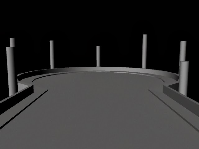
In order to get the perspective correct on the second painting I built a low poly model of the scene, rendered it and will composite it into the final painting. The polygon edges will also help in figuring the paving pattern.

Friday, 20 December 2013

Revised Thumbnail

Having spoke to my lecturer I found I had the wrong end of the stick...
I need to show more of the environment in the images so needed to zoom out. The final painting may go further out to show more of the tower theyre fighting on.
Time permitting I will also revise the image of Deathdealer fighting the the Kitzaak army.