Showing posts with label Creative Research. Show all posts

Saturday, 10 May 2014

Kara - Final Design

The Dota 2 character art guide was also useful when finalising the design as it has introduced me to "Value Patterning." Using the natural tendency of the human eye to seek out boundries and differences between different areas on a surface.
Distinguish between the different panels on the armour of the character. By lightening the blue and applying a carbon fibre texture to the plate. The Dota 2 character art guide was also useful when finalising the design as it has introduced me to "Value Patterning." Using the natural tendency of the human eye to seek out boundries and differences between different areas on a surface.
The Dota 2 Character Design Guide can be found at: http://media.steampowered.com/apps/dota2/workshop/Dota2CharacterArtGuide.pdf


The final design of Kara is ultimately what I was aiming for throughout the redesign. Between this and the other side of this project in Computer Arts Practice a number of aspects of my work have been highlighted that I need to work on and improve. Things such as tonal work, anatomy, lighting and overall consistancy of work.
I feel that I have a long way to go with my work but am hopeful as I think that since the beginning of this blog I have improved my skills.

Thursday, 1 May 2014

Kara - Colours

In keeping with the military style aesthetic, the colour schemes have been based on various uniforms from armed forces as well as looking into what kind of colours companies use when producing combat gear. 


Bar the green and desert style camo schemes I have tried to use colours that wouldn't be associated with a specific environment. I fond that distinguishing between the panels on the armored sections makes the designs look more interesting and gives a modular feel that could is a feature of the teams gear in the story giving them the ability to change the armour they wear depending on their target.
As always going forward I will seek feedback from my peers before deciding on a final design.

Tuesday, 22 April 2014

Kara - Iterations

Moving forward with the iterations of Kara I wanted to keep the overall silhouette and base of the previous post and focus on varying the detail on her gear. 


I wanted to have the character be comparable to current military and special forces. I feel that this makes the character more believable and easier to identify for audience.
As with the other character in this joint project I will seek feedback from peers, seeing which design is strongest before going forward with colour tests.

Tuesday, 8 April 2014

Kara - Initial Redesign

When starting to redesign Kara, like with Siyok a quick series of base sketches were done which were used to base the silhouettes on. These help me to produce more accurate silhouettes.


The sketches were then blocked out and detailed. Using reference collected before I am aiming for a character that is not too far removed from a modern military look.
After asking for the opinions of a couple of my peers I decided on 2 of the silhouettes to take forward.


I thought the more heavily armoured character felt a bit clunky so decided to move forward with the unarmored variant.
Like with redesigning Siyok, this design will be taken further and iterations produced before a final design is chosen.

Wednesday, 26 March 2014

Robert Mckee's Story

When looking into producing my series bible I was directed toward Story by Robert McKee.
Story is a book in which McKee describes in detail all aspects of the writing process from principles in writing a successful story to industry and a writer being successful within the field.


While I found a lot of the book went over my head, some of the points in the book made it through this thick skull of mine.

Reading made it clear that I had been going about this part of my project the wrong way.
When it comes to writing stories I only ever get so far because I try to come up with a situation and create a character to be stuck in it. Mckee talks about working from the inside out, creating characters then building their universes around them. However all aspects of creating a story must be considered together

Part 2: The Elements of Story and Part 3: The Principles of Story Design are particularly enlightening when trying to get started on building the universe around the characters. Reading these has given me new aspects to go about creating characters, worlds and introduced me to the idea of levels of conflict. This is an aspect of story telling that in the past I have neglected or not even considered in the past.

Another term I have been introduced to through this book are beats within scenes and stories. The points at which events happen within any story that give the characters something to react to in order to move the story forward.

When looking for ways to make these ideas I have taken from McKee's writing into visual story telling I have come across a set of Gnomon Workshop DVD's Visual Storytelling with Ian McCaig.

Monday, 24 March 2014

More Visual Research

The characters gear is to reflect current conventions for combat equipment yet have a sci fi feel. 
The best example of this kind of aesthetic I am aiming at is from the Metal Gear Solid game series in which the equipment used by characters is in keeping with the time in which each game is set i.e. the Cold War, the 90's or the near future but has a more technologically advanced look.


Thursday, 20 March 2014

Visual Research

For the redesign of the character Kara I have been looking at strong female characters from different media such as movies, comic books and games. 

Characters such as Starbuck (Battlestar Galactica) and Sara Connor (Terminator) have both been female protagonists in roles which in the past may have been reserved for male characters.
Design wise I aim to produce a character design that will suit the universe and situation where she is placed. The character will have a combat ready/militarized feel likened to modern mercenaries and military personel as in the story of Hunters Human technology has regressed to a state similar to our current level. Looking at how Commander Shepherd (Mass Effect) and Dr Shaw (Prometheus) were equipped may be too futuristic for the aesthetic I am looking at.
The 2 portrayals of Wonder Woman were done by illustrator Stjepan Sejic. The left image was his redesign of the character. He comments that this design would be difficult to recreate from panel to panel because of the complexity of the design. The second image was done as part of a style test to try and make the character more manageable. This is another aspect of the characters new design to take into account.

Saturday, 15 March 2014

What is a Series Bible?

A series bible is a document that is typically produced by the creator/co creator of a series of a series concept. Series bibles are typically used for TV, Movie and Comic Book Series.
They provide guidelines for the writer/writers a set of guidelines that aid in producing consistent story lines and universe.
My Series Bible will include:
Overall Concept
Ongoing Characters
Background
Setting
Rules of the Universe
Technology
Format
Tone
Theme
Outline for an opening story.

This was taken from an guide written by Kurt Hathaway, a comic letterer editor and writer with over 20 years experience in the industry.
The article can be found at: http://forum.webcomicscommunity.com/index.php?topic=868.0;wap2

Tuesday, 11 March 2014

Characters to Redesign

The other part of the joint project is to redesign 2 characters from the "Hunters" universe while fleshing out the story. Having spoke to lecturers as well as my fellow students I have decided on a character for each module.


The human character, Kara Tate (for now anyway) is the lead of the team of bounty hunters and captain of their ship, "The Adruinna." She is one of the survivors of the war against humanity, born on the day the war ended. Ultimately a bad ass who prides herself as being one of the most successful bounty hunters (though the other races wont aknowledge it). She has a love for anything that provides a connection to the Earth she never knew.

The alien character, is a criminal member of an amphibious race enhabiting the galaxy named Siyok. He is guilty of a multitude of crimes ranging human trafficking and abuse to war crimes during the 'Earth Wars'. A mercenary who is called upon for only the most questionable of contracts and general all around &%$£.

While reimagining them I do want to keep aspects of the originals. Tate will retain some hint of the wild west and military influences but will also be need to be given a more sci fi aesthetic. Ultimately I want to produce a design for a unique looking character who is believable in her role as the leader of a team of hard core intergalactic bounty hunters.
I want to give Siyok a more imposing, aggressive quality rather than looking like a disgruntled mutant gold fish but still keep the merman style tail instead of legs. The idea of making him more of a bottom feeder like certain species of catfish appeals. I think that the character needs to convey more of his personality and background. The way he is portrayed here could either be a pro or antagonist and I want to redesign him so there is no boubt that he is an evil character.

Tate will be redesigned as part of Creative Research and Siyok will be as part of Computer Arts Practice.

Wednesday, 5 February 2014

Semester 2 - The Plan Going Forward

Having spoke with both of my lecturers I plan to link my Creative Research and Computer Arts Practice projects together for semester 2.
In Creative Research I intend to go further developing the story used as a basis for the characters designed last semester. This will be done by creating a series bible that could be used as frame work to produce the first story arc for the comic series.

In Computer Arts Practice I aim to produce a pair of comic book covers intended for use on the comic series.
In each module I will also produced a final character design for the series based on both the series bible and last semesters designs. Though I feel that the previous case study on Grant Gould's art was educational it isn't the style I wish to push forward with.
Going forward I will be aiming for the more realistic, painterly style which I have been working toward since the beginning of this year.

Saturday, 7 December 2013

Realistic Style

These 2 paintings were done using some photographic reference for the anatomy of the animals, looking into the workflow of Stjepan Sejic. Typically I produce a lot of line work and flat colour or limited rendering to achieve a more graphic style (like the previous study) to my work but really want to push more to a painterly style of art seen in work by the artists I mentioned previously. 
Initially I had intended to take the characters I had started designing previously but to be honest this is such a different workflow to how I normally work and I felt that working on something more familiar for which I could find reference, this would allow me to focus more on the techniques rather than the designing the subject matter.

The aim of these paintings were to try and push myself to paint more using shape and tone rather than spending a lot of time on line work. I limited myself to 20 minute sketches, not going into too much detail with the initial drawings as seen in Stjepan Sejic's workflow. I found this a difficult workflow to follow as I am used to having the detail already drawn in before moving forward with a rendering. However I found that having a more detailed made me restrict myself too much.

This was the first time I have attempted to make or use a texture brush in Photoshop (though I didnt think to do so until about half way through the Gorilla : / ) 
Though there are a couple of areas in each painting where the values are not spot on I feel that this has been a successful and very educational exercise. For me this workflow seems to be far more suitable when working digitally when compared to the workflow explored while looking at Grant Gould's work and aesthetically I do prefer the more realistic style that it produces.
I would like to go further and produce a series of studies on animals like these as I found this not only very educational as far as learning more about tone, lighting and texture but also as I am a big animal lover found this very enjoyable.
Could do with colour though.... 


Wednesday, 13 November 2013

The purpose of this exercise was to improve my digital line work as well as start to redesign the characters from my old college project. Through doing this study I have figured out how to set brushes up that produce clean, smother line work. Also through a bit of research into Illustrator I have discovered the "Live Trace" tool which when used on black line work can be used to tweak the final thickness, tapering and smoothness of the line by using presets or by individually adjusting different values individually.


While I have found this a valuable case study i do feel that doing this digitally is far to time consuming for me at my current level of proficiency with a graphics tablet. A more time effective work flow for this style of art would be to ink the lines traditionally then scan the work in, separate the line work from the background (which is very quick to do as it turns out) then process that through Illustrator before painting in colour and tone.


Style wise I am fairly happy with this work, I achieved a style roughly what I was aiming at however I am looking forward to taking these further and into a more realistic art style which I will explore next. 
Design wise I feel these serve as a decent starting point for the characters but I want to develop them further. 
The characters are based on an idea for a comic book series. The story follows the exploits of a team of intergalactic bounty hunters in a future when humans are considered as one of the lowest species in the galaxy. 

Saturday, 19 October 2013

Cartoon Style Art

The first thing I am going to do is conduct a series of case studies of artists who are particularly adept in areas which I am not. After this I Intend to produce either a short preview comic based on an old project from college that I wanted to take further which centres around a team of intergalactic bounty hunters...... Sounds really cheesey when I put it like that.
The first case study I will conduct is on Grant Gould who has been responsible for the majority of the promotional art, "How to Draw" and illustrative work for "Star Wars: Clone Wars," "Star Wars: Galaxy", "Blade Raiders" The fantasy role playing card game as well as his self produced web comic "Wolves of Odin".


The reason I have chose his work to look at is because his line work is particularly good when produced digitally. One of the things I struggle with is doing clean line work digitally. Thought I am trying to aim for a more realistic, painterly style nowadays, I feel that to be more flexible in styles in both traditional and digital media would improve my employment prospects in the future.

Sunday, 13 October 2013

Feedback

Presentation was given and though it went fairly well I have been advised to narrow down my subject matter. To be fair there were A LOT of things to cover and probably too much to really get to grips with one area or to make really meaningful improvements. I have given it a bit of a rethink and have figured out what way to go for this semester.
I plan to look at workflows when creating artwork digitally in different styles; Cartoon/Vector art versus Realistic/Painterly style artwork. This will make me work differently and hopefully aid me in refining my own workflow when working digitally as well as improve my knowledge and skills working digitally.

Tuesday, 1 October 2013

Presentation 1

Throughout this module there are many areas in which i want and need to improve on. For my first presentation I am giving an overview of my previous work and looking at what needs improved in general.


2nd year Digital visualisation was my first project that was produced completely digitally, The goal was to produce a character and an environment. I chose to produce designs for a pilot and the air base where she was based. 3D Production was tied into this and the result was a matt painting of an enhanced F15 fighter jet.


This project was another first as I hadn't attempted a matt painting before. Though these both had their issues they made me far more aware of different techniques and work flows. Plus I got to paint a fighter jet...... this makes me happy.


2 artists who inspire me are Stjepan Sejic (left) and Baron Tieri (bottom right). Both are experts in their fields and all 3 combine 3D and 2D to create their work.
Sejic is an illustrator whose best known work is on Top Cow's comic book series Witchblade and now writes and illustrates his self created comic Ravine. Sejic combines 3D and 2D in his comic book work which aids in maintaining consistancy when dealing with portraying characters.
Baron Tieri is a concept artist, Tieri use 3D to produce their work but both use varying methods. Tieri uses simple blocked out models in order to compose scenes then paints over them to create vistas which are comparable to old masters oil paintings.


3D and matt painting has proven incredibly powerful and versatile tools to either speed up pipelines, maintain consistancy and enhance 2D art.


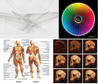
Some of the areas which I need to improve in order to fully utilise 3D compsiting and matt painting are perspective and colour theory. In general with digital painting I need to refine my work flow and work out a process to follow. I feel that in my traditional work I am far faster and accurate in producing work and want to get to the same level with my digital work.


Saturday, 28 September 2013

Where to Begin?

With Creative Research I am looking forward to when I am finished with University and looking to get work Professionally. I aim to specialize in 2D artwork (be it design work for games or film), or illustrative work (for comics, books, book covers etc).
Either way which ever way the future takes me I need to improve my skills in both illustration and design.  
Having made the transition from traditional media to digital last year I feel that there is a greater scope for fields of research. 

My initial thoughts on areas to research include:

- Improving my digital painting for illustration and design.
- Matt Painting and its uses in illustration and design work.
- Increasing my productivity with digital media.