Monday, 10 November 2014

Hungarian Horntail Strip

With this strip I focused on trying to speed up my work flow by spending less time on the drawings of these panels and going for a more painterly approach. Though these pages are really only rough layouts they are revealing aspects of my work that I need to improve on or learn.
One of the first problems I came across with this strip was composing it so it made sense and flowed. 
During research will be looking into some of the principles of cinematography. While I was aware of the different kind of camera angles (bird's eye, worm's eye, long shot, close up etc.) I had not considered that film making principles such as the 180 degree rule are so important when producing cohesive pages in comics and graphic novels.


One of the biggest issues I have found is consistency in the art is lacking. Though I have looked into this, the best advice and methods involve more in depth character design processes than I am undertaking with these tests.
Learning to compose more suitable and interesting layouts is another, Though I understand the theory behind formal and informal layouts I feel that I need to work a lot more on this aspect of production. 
This and the previous strip I have produced have not featured any dialogue. I will be looking into scripts and their formats next before continuing on with the next character design/strip exercise.


Wednesday, 5 November 2014

Visual Narrative

The desire to tell and pass down stories has been part of human culture since the early days of our species. Paintings on cave walls depicting events from the lives of early humans have provide a glimpse into their lives. Today the desire to tell stories is still as deep routed in human culture as it was for early man.  


The term “Visual Narrative” is derived from the two words Visual and Narrative (surprisingly) and describes the telling of stories through visual means.
Throughout history each culture has developed their own unique method of conveying stories to their audience. Ancient Greek and Chinese ceramics depicting important events from their culture, sculptural reliefs and paintings within religious temples of most cultures are all examples of visual narrative. Over the centuries this has evolved into various different art forms such as films, animation and historical painting.


Comic books and graphic novels are also part of this group. Will Eisner published the book Graphic Storytelling and Narrative in which he defined comics as “the printed arrangement of art and balloons in sequence”.
Comics and Graphic Novels are considered Static Visual Narratives. Like Murals, sculptural reliefs and paintings comics are part of a medium that occupy surface area. The viewer discovers the story by exploring the area covered by the visual elements. As the viewer progresses the story is revealed. The stories in this type of visual narrative are revealed at the viewer’s discretion, leaving it up to them how much time is spent on the different elements of the visual and what order it is viewed. This is opposed to Dynamic Visual Narrative such as film or animation where the viewer is presented the visuals in a predetermined pace and sequence or Interactive Visual Narrative where the story progresses through the participation of the viewer.
These methods of telling stories have been developed over decades and centuries. They allow us to communicate where, when, how, why and what happened when an event occurred. Whatever the story it can be told through Visual Narrative, the visual element gives the story teller the ability to not only describe the characters, locations and events but also show them to the viewer.


Character Design challenge 3

This is the character produced for Callum MacDougall based on the description of the Hungarian Horntail dragon from the Harry Potter series.


I tried having a look at eagles and their anatomy to influence the design rather than just looking at lizards like I have in the past when drawing/painting dragons.
Overall I think the design, while fairly successful at communicating the description of the creature the overall design is pretty generic.
More importantly though, Callum was pretty happy with the effort.

Sunday, 2 November 2014

Alien MMA Fighter Strip

Rather than going for a character design then taking it into a final painting it was suggested that I put them into situations and depict them through comic book pages.
This was the strip produced for the Alien MMA fighter. 
While creating the page I wanted to keep it traditional, working within conventional page dimensions and layout A). to see how restrictive it can be and B). so I could focus on composing the art within the panels as I feel that composition isn't one of my stronger areas.


One thing I have been curious about with modern comic/graphic novel production is utilizing 3D as a tool to aid in production so for the 3rd, 4th and 5th panel a small block out of the arena was made. This aided in speeding up the process of painting each panel as well as keeping the perspective in each shot correct. This type of process is used by environmental artists like Baron Tieri in the games industry as well as a few comic book artists such as Stjepan Sejic. This is a method that I will explore further as I produce future designs and strips this semester.


For this strip a my classmate Juan Carlos De Abreu was kind enough to donate his weekly character design to take on the green meanie.

Monday, 27 October 2014

Comic Book Layouts

The comic book layout is the order and composition of individual panels which hold the art, dialogue, narration and effects. When read in sequence the panels tell the story of the comic.
This aspect of comic book production is as important as script and art as without an engaging and more importantly an understandable flow to the pages, reading the pages can become confusing and break the concentration of the reader.


Traditionally Comic panels were laid out in a grid pattern, the reader 2x2, 3x2, 3x3 etc. The reader would read each row, left to right before moving to the next row. An example of this can be seen below in the fight between Captain American and Batroc the Brawler.


As comics grew, their layouts began to variations on this. Differing panel sizes to emphasize important moments within scenes, differing the number of panels on the page to allow for larger, more impactful images or letterbox style panels which can help to give a more cinematic feel to a scene. Below is an example of this from “Batman: Hush.” Jim Lee has used a combination of letterbox and more square traditional panels to differentiate between the faster pace part of the scene from the panels with important dialogue and events.


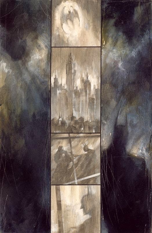
When producing the art for “Batman: Arkham Asylum” Dave McKean took traditional convention another way. By using letterbox style panels and laying them out on their end gave the graphic novel a looming, oppressive feel which fit with the mood and atmosphere of the story.


Alex Ross developed a style that uses both traditional and more radical techniques to create his work on Batman: Black & White as well as “Batman: War on Crime”. Ross is known for his layouts that defy many conventions when laying out pages, often forgoing margins or even separation lines between panels. Choosing to instead blend the panels artwork together, creating pages that are seamless works of art which often resembled large splash pages. With the addition of narration and dialogue to his art Ross’ work becomes a unique and visually appealing experience.


When it comes to the placement of speech bubbles in comic art consideration first is given to the size as well as the amount of dialogue in each bubble or box. Large speech bubbles and large amounts of dialogue are usually nessessary to propel the story forward in character driven stories. When laying out a comic the artist must be careful to give enough space for dialogue while not allowing it to dominate the panels. Often larger bubbles are broken up over a couple of panels. This also allows the flow of the conversations between characters to be broken up, giving the characters a chance to “breath” and for the conversations to flow more naturally. Often to aid the reader and make the flow of the dialogue easier to follow by the reader visual cues can be put into a series of panels. In the below example the reader is directed by the eye line of the characters. Even though dialogue is placed throughout the page, thanks to this visual cue it is easier to interpret the intended order of the speech bubbles.


Character Design Challenge 3

This weeks challenge is a request from one of my peers. He has asked a number of people to produce their interpretation of the Hungarian Horntail Dragon from the Harry Potter books.
This is the description he has provided: "Supposedly the most dangerous of all the dragon breeds, the Hungarian Horntail has black scales and is lizard-like in appearance. It has yellow eyes, bronze horns and similarly coloured spikes that protrude from its long tail. The Horntail has one of the longesr fire-breathing ranges (up to fifty feet). Its eggs are cement-coloured and particularly hard-shelled; the young club their way out using their tails, whose spikes are well developed at birth. The Hungarian Horntail feeds on goats, sheep and, whenever possible, humans."

Sunday, 26 October 2014

Character Design Challenge 2 - Development

This design challenge was to produce a design for a Sci Fi MMA fighter that would fight in the galactic version of the UFC. 


The idea was to create a character that would pose a different challenge to an MMA fighter while still being familiar enough anatomically to take on humans.
I was trying to play around with a style half way between the realistic style and the more cartoony, characature style i used to favor. The reason for this is for speed of production when reproducing the character(s) for sequential pages.
The other part of this challenge is to take one of these forward and produce a short 1 or 2 page strip depicting a fight scene featuring one of the characters, giving me an exercise to explore layouts.