The comic
book layout is the order and composition of individual panels which hold the
art, dialogue, narration and effects. When read in sequence the panels tell the
story of the comic.
This aspect
of comic book production is as important as script and art as without an
engaging and more importantly an understandable flow to the pages, reading the
pages can become confusing and break the concentration of the reader.
Traditionally
Comic panels were laid out in a grid pattern, the reader 2x2, 3x2, 3x3 etc. The
reader would read each row, left to right before moving to the next row. An
example of this can be seen below in the fight between Captain American and
Batroc the Brawler.
As comics
grew, their layouts began to variations on this. Differing panel sizes to
emphasize important moments within scenes, differing the number of panels on
the page to allow for larger, more impactful images or letterbox style panels
which can help to give a more cinematic feel to a scene. Below is an example of
this from “Batman: Hush.” Jim Lee has used a combination of letterbox and more
square traditional panels to differentiate between the faster pace part of the
scene from the panels with important dialogue and events.
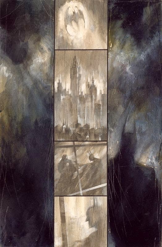
When
producing the art for “Batman: Arkham Asylum” Dave McKean took traditional
convention another way. By using letterbox style panels and laying them out on
their end gave the graphic novel a looming, oppressive feel which fit with the
mood and atmosphere of the story.
Alex Ross
developed a style that uses both traditional and more radical techniques to
create his work on Batman: Black & White as well as “Batman: War on Crime”.
Ross is known for his layouts that defy many conventions when laying out pages,
often forgoing margins or even separation lines between panels. Choosing to
instead blend the panels artwork together, creating pages that are seamless
works of art which often resembled large splash pages. With the addition of narration
and dialogue to his art Ross’ work becomes a unique and visually appealing
experience.
When it
comes to the placement of speech bubbles in comic art consideration first is
given to the size as well as the amount of dialogue in each bubble or box. Large
speech bubbles and large amounts of dialogue are usually nessessary to propel
the story forward in character driven stories. When laying out a comic the
artist must be careful to give enough space for dialogue while not allowing it
to dominate the panels. Often larger bubbles are broken up over a couple of
panels. This also allows the flow of the conversations between characters to be
broken up, giving the characters a chance to “breath” and for the conversations
to flow more naturally. Often to aid the reader and make the flow of the
dialogue easier to follow by the reader visual cues can be put into a series of
panels. In the below example the reader is directed by the eye line of the
characters. Even though dialogue is placed throughout the page, thanks to this
visual cue it is easier to interpret the intended order of the speech bubbles.


No comments:
Post a Comment