Sunday, 29 December 2013

Painting 2 - Matt Painted Tower

In order to get the perspective correct on the second painting I built a low poly model of the scene, rendered it and will composite it into the final painting. The polygon edges will also help in figuring the paving pattern.

Friday, 20 December 2013

Revised Thumbnail

Having spoke to my lecturer I found I had the wrong end of the stick...
I need to show more of the environment in the images so needed to zoom out. The final painting may go further out to show more of the tower theyre fighting on.
Time permitting I will also revise the image of Deathdealer fighting the the Kitzaak army.

Coloured Thumbnails

Taking the thumbnails further and ran some colour tests on each one. With the fight between Deathdealer and Klang (top) I was unsure with which one to choose to take further. I chose to use the side on scene as this shows both characters in full view as well as more of the surrounding area.

Friday, 13 December 2013

Composition Thumbnails

On to development. These are the thumbnail sketches that were produced in order to work out the composition for the final paintings. From these I will choose the final 3, refine the images, run some colour tests then start the final paintings.


Saturday, 7 December 2013

Realistic Style

These 2 paintings were done using some photographic reference for the anatomy of the animals, looking into the workflow of Stjepan Sejic. Typically I produce a lot of line work and flat colour or limited rendering to achieve a more graphic style (like the previous study) to my work but really want to push more to a painterly style of art seen in work by the artists I mentioned previously. 
Initially I had intended to take the characters I had started designing previously but to be honest this is such a different workflow to how I normally work and I felt that working on something more familiar for which I could find reference, this would allow me to focus more on the techniques rather than the designing the subject matter.

The aim of these paintings were to try and push myself to paint more using shape and tone rather than spending a lot of time on line work. I limited myself to 20 minute sketches, not going into too much detail with the initial drawings as seen in Stjepan Sejic's workflow. I found this a difficult workflow to follow as I am used to having the detail already drawn in before moving forward with a rendering. However I found that having a more detailed made me restrict myself too much.

This was the first time I have attempted to make or use a texture brush in Photoshop (though I didnt think to do so until about half way through the Gorilla : / ) 
Though there are a couple of areas in each painting where the values are not spot on I feel that this has been a successful and very educational exercise. For me this workflow seems to be far more suitable when working digitally when compared to the workflow explored while looking at Grant Gould's work and aesthetically I do prefer the more realistic style that it produces.
I would like to go further and produce a series of studies on animals like these as I found this not only very educational as far as learning more about tone, lighting and texture but also as I am a big animal lover found this very enjoyable.
Could do with colour though.... 


Tuesday, 3 December 2013

Visual Research and Reference

Going forward I have been collecting a large selection of visual research for the project. Everything from horses to volcanic regions, ancient Mongolian warriors to the some of the baddest men on the planet today from the UFC.

A few examples of portrayals of fantasy warriors by artists such as Adrian Smith.

Varying body types of MMA fighters in the UFC. Contrary to popular beliefs, the majority of truly successful fighters though highly athletic don't look like they're aiming to compete in Mr Universe. Given that Death Dealer is written to be around 6 foot 4, tanned with dark hair I will be looking at fighters from the heavyweight division such as Cain Valasquez and Junior Dos Santos for reference.

One of the final paintings will portray Death Dealer on horseback taking on the Kitzaak army. For reference for the horse I am looking at Shire, Clydesdales and Draft Horses for their sheer size and heavy set set proportions.

 
The second image will protray Death Dealer taking on the Warlord Klang who has been transformed into a huge lizard man by the Master of Darkness. Looking Having a look at lizards with interesting features to take influence for the design.

The final image I intend to produce will portray the volcanic region where the Temple of the Master of the Master of Darkness sooooo..... volcanicness.

Thursday, 28 November 2013

What I Plan to do to Fulfill the Brief

For this project I intend to produce 3 digital paintings portraying 3 of the key scenes from the series of Death Dealer book Prisoner of the Horned Helmet.

Scene 1: Depicting the event in the book when Cobra takes Gath to the Temple of the Master of Darkness to give hem the horned helmet and arm him with the weapons to destroy the Kitzzak army. 

The scene will be either an external shot of the temple in the Smoking Lands, a volcanic region in the world of Death Dealer. Or a shot of the interior showing the shrine to the Master of Darkness with the giant Saurian  (reptilian) skull in which the helmet resides.

Scene 2: An action shot of Death Dealer on horseback fighting the Kitzaak Army.

Scene 3: An action shot of Death Dealer facing off against the Warlord Klang after Cobra has given him the potion giving Klang the power of the Master of Darkness, turning him into a huge lizard man.

Visual research and Development work to follow.

Death Dealers - Character Origins

Before becoming the Death Dealer, Gath was once a man, a tribeless barbarian who was raised in an uninhabited forest. His parents were murdered before his eyes as a child, and he managed to escape to the woods. He Became an experienced hunter and survivor by adolescence, by his adulthood stories had spread to the surrounding tribes.

Sometime later the forest and surrounding lands are invaded by a group of foreigners named the Kizzaks. Cobra a young girl who has heard stories of Gath and his savagery, tries to seek his help. While trying to convince him she falls in love and fearing for his death, Cobra decides to help him by giving him a helmet possessed by the god of death. She leaves an axe and the god possessed helmet, in the forest Once Gath touches it, the dark helmet had sprung forth tentacles and before he could realize what was happening, he was enveloped by the tentacles. The horned black helm's glowing red eye's fixed on it's host, and he could not fight its grip. Once enveloped the tentacles covered and entered his body, fusing the helm to him. The helmet gives Gath godlike abilities while also torturing him. He manages to gain help from various people he found in the forest, and learned to control the helmet. Gath then fights the Kizzak horde, as a one man army and wins.

Tuesday, 26 November 2013

Looking further into Frazetta's work and methods I found a feature from a past Imagine FX featuring Jean-Sebastien Rossbach demonstrating how the Frazetta style of art could be translated digitally. The process is similar to traditional oil painting which I am a bit familiar with from a couple of my precious projects. Being able to translate this work flow digitally is something I have been wanting to learn since I started working digitally.
The tutorial from the magazine details the process from previsualization, through to the final product as well as using paint textures to give the painting a more traditional look and feel.


Thursday, 14 November 2013

Initial Research


Mood boards showing a selection of Frazetta's worksbased on The Death Dealer (Top) as well as a selection of his other Sci fi and Fantasy paintings.


Wednesday, 13 November 2013

The purpose of this exercise was to improve my digital line work as well as start to redesign the characters from my old college project. Through doing this study I have figured out how to set brushes up that produce clean, smother line work. Also through a bit of research into Illustrator I have discovered the "Live Trace" tool which when used on black line work can be used to tweak the final thickness, tapering and smoothness of the line by using presets or by individually adjusting different values individually.


While I have found this a valuable case study i do feel that doing this digitally is far to time consuming for me at my current level of proficiency with a graphics tablet. A more time effective work flow for this style of art would be to ink the lines traditionally then scan the work in, separate the line work from the background (which is very quick to do as it turns out) then process that through Illustrator before painting in colour and tone.


Style wise I am fairly happy with this work, I achieved a style roughly what I was aiming at however I am looking forward to taking these further and into a more realistic art style which I will explore next. 
Design wise I feel these serve as a decent starting point for the characters but I want to develop them further. 
The characters are based on an idea for a comic book series. The story follows the exploits of a team of intergalactic bounty hunters in a future when humans are considered as one of the lowest species in the galaxy. 

Saturday, 9 November 2013

My Chosen Brief


I have chosen to work to the brief for Concept and Pre Production Design. I feel that this Brief will really push me to improve my digital painting skills. 

The Brief Outline:

This unnamed film is set in the gritty and violent world of Frank Frazetta’s ‘The Death Dealer’. Your task is to develop 3 professional quality concept scene images which describe 3 potential scene designs for the film. The producers are keen to retain the classic Frazetta ‘semi-realistic’ style but they will allow creative license as long as the atmosphere and mood of the project is underpinned. They also mentioned the existing popularity of gritty realism in entertainment appeals to them.


Frank Frazetta's painting style has always been something that I have aspired to after seeing a selection of his work based on Conan in this book (below). Thanks to mum and dad many moons ago.

The majority of the time my work revolves around character or environment design, this brief will also prove a challenge to work in this context which for some reason very rarely happens. As a result of this i feel that I have missed opportunities to produce finished digital paintings portraying full scenes and this brief would be ideal to get a start on adding this type of work to my portfolio.
One of my goal since starting to paint digitally is to translate my knowledge of traditional oil painting to digital media and I feel that this brief will give me the opportunity to explore this further.


Friday, 25 October 2013

Evaluation 6 - Quick Character Design

This sketch was done while chatting with a friend about a comic book idea he was playing around with about a character called Captain Venezuela. The comic was to be a more gritty and humorous version of Captain America.
I felt that this would be a good piece to add in as my final evaluation as it goes back to Live Drawing. Using the process I have learned doing those exercises has made me plan sketches with more attention to the subject's character. 
Juan wanted a strong, no nonsense character based on a luchadore and Captain America with a gun. The character was to look like a retired athlete who has let himself go a bit. 
The small sketch was an idea for a tattoo initially for Captain Venezuela but started to evolve into an idea for a villain.
I feel the final image represents what we were aiming for so in that light it was a success. There are issues though like his foot. Through doing more fast exercises I am finding that I am able to notice my mistakes more and am able to correct them. Issues with anatomy crop up and I think that though I don't catch them all now I am noticing them a lot are worked out while working on images. 

Saturday, 19 October 2013

Cartoon Style Art

The first thing I am going to do is conduct a series of case studies of artists who are particularly adept in areas which I am not. After this I Intend to produce either a short preview comic based on an old project from college that I wanted to take further which centres around a team of intergalactic bounty hunters...... Sounds really cheesey when I put it like that.
The first case study I will conduct is on Grant Gould who has been responsible for the majority of the promotional art, "How to Draw" and illustrative work for "Star Wars: Clone Wars," "Star Wars: Galaxy", "Blade Raiders" The fantasy role playing card game as well as his self produced web comic "Wolves of Odin".


The reason I have chose his work to look at is because his line work is particularly good when produced digitally. One of the things I struggle with is doing clean line work digitally. Thought I am trying to aim for a more realistic, painterly style nowadays, I feel that to be more flexible in styles in both traditional and digital media would improve my employment prospects in the future.

Friday, 18 October 2013

Evaluation 5 - Live Drawing 2


Another round of Live Drawing in town. I found this round more comfortable that previously. This time rather than using a pencil then inking over it I went straight into the drawing in ink. This sped up roughing in the poses.
Overall compared to my previous Live Drawing exercise I feel that these show more of the character of the subject.
Due to doing a few of Live Drawing sessions I am more confident in my mark making while sketching as well as becoming more accurate.


Thursday, 17 October 2013

Evaluation 4 - Perspective 2


After doing the initial Perspective exercise it occured to me that I have never tried to draft up perspective digitally. In the past I have relied on blocking images in traditionally then scanning in the rough image.
Where I am fairly comfortable with the principles of 1, 2 and 3 point perspective and am happy to do this traditionally I hadn't worked out a process to do this.
I will have to revisit this sort of image in the future as I need to explore further how Photoshop's functions such as the transform and warp tools could be used to apply rendering and texture to the objects.
This was useful to start a work flow for plotting out perspective digitally as it is more streamlined but I found this took a lot longer to lay out than it would traditionally.
Another way to lay out perspective is to block out an image in 3D, then composite a render into a digital painting.

Tuesday, 15 October 2013

Evaluation 3 - Live Drawing


This weeks task was to go into town and do Live Drawing. The idea is to quickly capture the essence of a person quickly, not focusing on producing a realistic likeness of them.
I found this task could be very useful as reference for later projects as well as help to loosen up when drawing.
I found this task difficult, trying to capture people quickly while not getting too bogged in detail early. I found myself penciling in the people as i would in Life Drawing, starting with the skeleton. I will try this exercise again and try to focus more on the motion and manner of the people.

Sunday, 13 October 2013

Feedback

Presentation was given and though it went fairly well I have been advised to narrow down my subject matter. To be fair there were A LOT of things to cover and probably too much to really get to grips with one area or to make really meaningful improvements. I have given it a bit of a rethink and have figured out what way to go for this semester.
I plan to look at workflows when creating artwork digitally in different styles; Cartoon/Vector art versus Realistic/Painterly style artwork. This will make me work differently and hopefully aid me in refining my own workflow when working digitally as well as improve my knowledge and skills working digitally.

Monday, 7 October 2013

Evaluation 2 - Tonal Study


For Week 2's exercise we were asked to produce a still life image focusing on tone. 
I feel this drawing went well. Using directional cross hatching helped to give more of a sense that the objects are 3D on the folded paper but rendering the curve of the vase was difficult to make believable. 
My lecturer instructed me to darken the background and the image came together. This task made me realise how important the background tone is to making an image look more complete.
Overall I am happy with this image. I mentioned in a previous post that I spend too much time cleaning up sketches and line work. With this I tried to get past this and though it looks harsh on the cross hatching this image feels more about tone and less about the line.

Evaluation 1 - Perspective


First week back at uni for Computer Arts Practice we were tasked with sitting somewhere on campus and doing a perspective study.
The thing I found most challenging was framing the image and creating a sense of depth using the pillar on the left. I found that getting the dimensions of the back wall was the key and figuring out my horizon line.
One of my biggest issues is that I spend too long on initial sketches. I find that I will draw something for a long time and spend too little time on the rendering so this looks harsh.

Tuesday, 1 October 2013

Presentation 1

Throughout this module there are many areas in which i want and need to improve on. For my first presentation I am giving an overview of my previous work and looking at what needs improved in general.


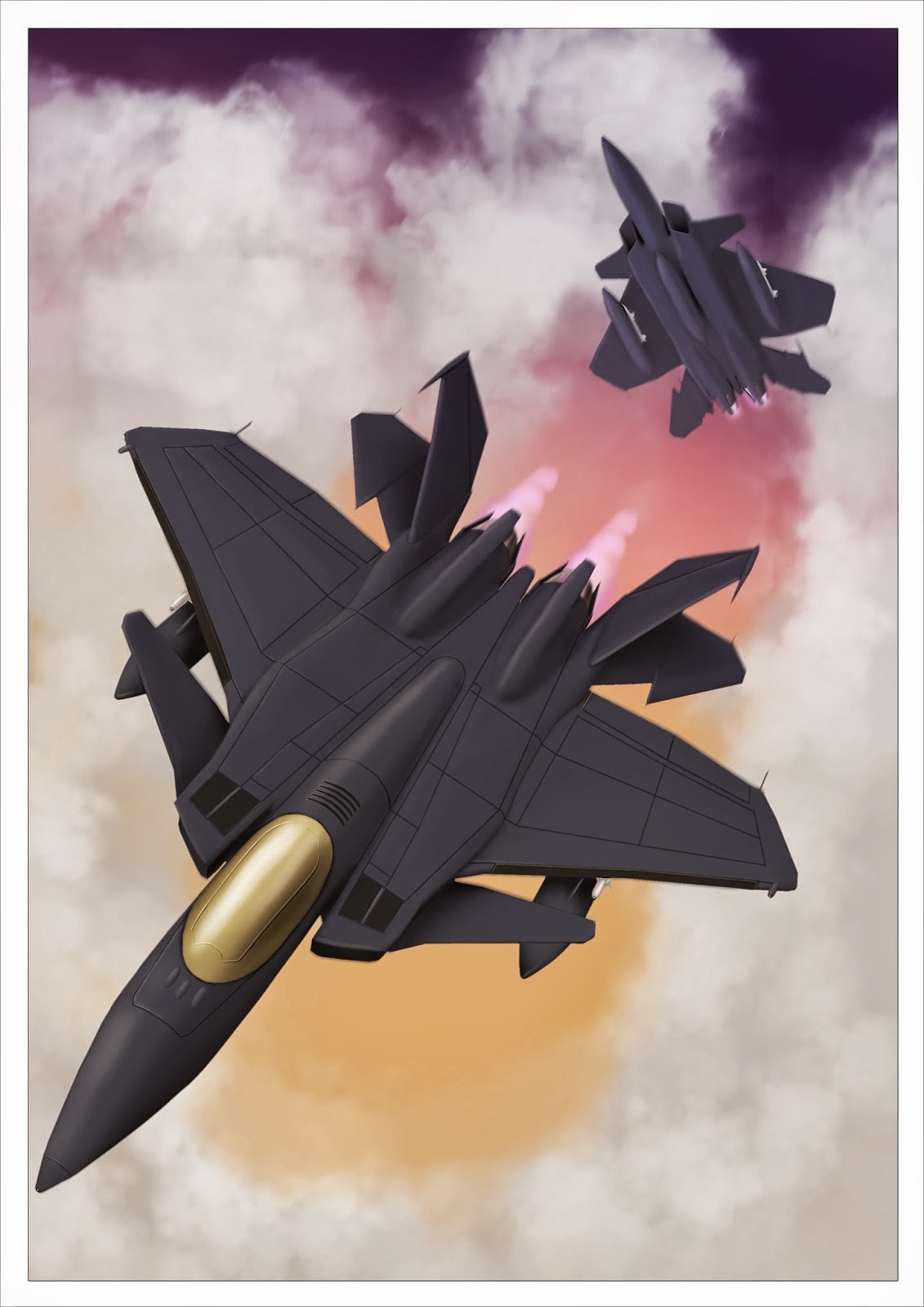
2nd year Digital visualisation was my first project that was produced completely digitally, The goal was to produce a character and an environment. I chose to produce designs for a pilot and the air base where she was based. 3D Production was tied into this and the result was a matt painting of an enhanced F15 fighter jet.


This project was another first as I hadn't attempted a matt painting before. Though these both had their issues they made me far more aware of different techniques and work flows. Plus I got to paint a fighter jet...... this makes me happy.


2 artists who inspire me are Stjepan Sejic (left) and Baron Tieri (bottom right). Both are experts in their fields and all 3 combine 3D and 2D to create their work.
Sejic is an illustrator whose best known work is on Top Cow's comic book series Witchblade and now writes and illustrates his self created comic Ravine. Sejic combines 3D and 2D in his comic book work which aids in maintaining consistancy when dealing with portraying characters.
Baron Tieri is a concept artist, Tieri use 3D to produce their work but both use varying methods. Tieri uses simple blocked out models in order to compose scenes then paints over them to create vistas which are comparable to old masters oil paintings.


3D and matt painting has proven incredibly powerful and versatile tools to either speed up pipelines, maintain consistancy and enhance 2D art.


Some of the areas which I need to improve in order to fully utilise 3D compsiting and matt painting are perspective and colour theory. In general with digital painting I need to refine my work flow and work out a process to follow. I feel that in my traditional work I am far faster and accurate in producing work and want to get to the same level with my digital work.


Saturday, 28 September 2013

Where to Begin?

With Creative Research I am looking forward to when I am finished with University and looking to get work Professionally. I aim to specialize in 2D artwork (be it design work for games or film), or illustrative work (for comics, books, book covers etc).
Either way which ever way the future takes me I need to improve my skills in both illustration and design.  
Having made the transition from traditional media to digital last year I feel that there is a greater scope for fields of research. 

My initial thoughts on areas to research include:

- Improving my digital painting for illustration and design.
- Matt Painting and its uses in illustration and design work.
- Increasing my productivity with digital media.